As courses and conferences continue to move online due to the Covid-19 pandemic, now is the time to ensure online content meets accessibility standards. Whether creating a word document, PowerPoint presentation, digital exhibit, website, eBooks, etc., accessibility is essential.
Accessibility design can be described as “focus[ing] on users with physical or invisible disabilities like low vision, blind, or ADHD,” and “on enabling users with disabilities to perceive, interact, understand, and navigate products” (Bruschi, para. 3). Other factors, such as age, language, or technological challenges are also things to consider.
Below are a few tips and tools to keep in mind when creating your next virtual presentation, online course, or research paper.
Things to consider:
A lot of the tips below are to help screen readers and other assistive technology translate what is on the screen.
- Text size, font, and font color
Have you heard that you shouldn’t overload your Powerpoint presentations with a lot of text? Well, this is one of the reasons why. It can be difficult for those without any impairments to read a crowded slide overloaded with text and photographs. You want content that can be easily seen and heard, so text size and the type of font used is important. Font color can also be an issue as some people are red/green colorblind. We’re using Powerpoint as an example, but this can be applied to a lot of online content, including website design.
- Use headings!
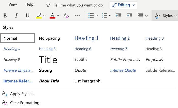
Pages should have clear titles and be organized using descriptive section headings. While it may seem easier to just enlarge the font and bold and/or underline our section headings, using the pre-determined headings in tool bars, like Microsoft or other authoring tools, is better. They are already designed to be read appropriately by assistive technology and help break up a research paper or article correctly.

- Use alt text for images and non-text content
Alternative text should describe the function or purpose of the content or a description of the image. For example, an alt text for a search button should say “search” vs “magnifying glass.” For a photograph of Beth’s cat Gabe, an appropriate alt text describing the image would be, “Long-haired white cat sleeping on top of toy.”

- Use captions and other alternatives for audio-visual media
Provide captions or a transcript for media with sound for those who are hearing impaired. Audio descriptions, which are narrations to describe important visual details in a video, are helpful for those visually impaired.
- Don’t use flashy or fast-moving media
Avoid using content that flashes at certain rates or patterns. It can cause photosensitive reactions, including seizures.
Tools:
A lot of platforms and products like Microsoft Office, Adobe, and Learning Management Systems like Canvas have accessibility checkers. Accessibility Checkers are a good tool to use to make sure that headings and alt text are in place. However, keep in mind that they might not enforce or follow all best practices (such as font color, size, etc.).

There are a lot of other free tools and evaluations you can use to check the accessibility of your content, such as the color contrast used for text and background, like the Accessibility Color Wheel. Check out the link under resources for more tools.
Resources:
For more detailed information about accessibility design and functions for different platforms, check out the following resources.
- IU East Center for Faculty Development: Accessibility Statements for Canvas, YouTube, Microsoft, and Adobe
- W3C Web Accessibility Initiatives: Accessibility Principles
- Web Accessibility Evaluation Tools List
- Website Accessibility Best Practices
- Universal Design
This is just a brief overview and some general things to consider in terms of making your work accessible in a virtual environment. In terms of accessibility and universal design, there is a lot more to explore. For more information or guidance, especially when it comes to course creation in Canvas, you can reach out to the IU East Center for Faculty Development. For any other research help exploring this topic, Ask Us! at iueref@iue.edu
Bruschi, Alexandria. (2020, April 6). “What pandemics can teach us about universal design.” UX Collective: https://uxdesign.cc/covid-19-what-it-can-teach-us-about-universal-design-fc54c0426ecb

